

Card Printing for Tarot Decks: What Buyers Should Look for Before Approving a Run
Card printing is never just about ink on paper. In a product like a tarot deck, it also shapes how the deck feels in the hand, how it sits on a retail shelf, and whether the packaging makes the right first impression. For sourcing teams and product managers, that means the decision is part print-buy, part packaging-buy, and part brand protection exercise.
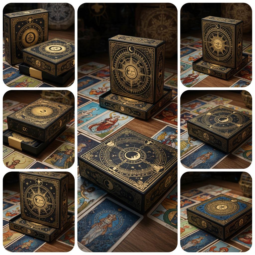
The tarot deck examples in this category make that clear. You are not only printing individual cards; you are also dealing with rigid cartons, decorative artwork, color variation across box designs, and presentation value. That is why business card printing logic does not fully apply here, even though some of the same production questions show up. The buyer has to think through visual impact, finishing, durability, and the practical job of protecting the deck during handling and retail display.
Why this type of printing matters to the buyer
When a consumer picks up a tarot product, the packaging is doing a lot of the selling before the cards are ever shuffled. A cleanly printed tuck box with ornate graphics, gold-style accents, or a black-and-white themed design signals a different market position than a plain carton. For gift shops, occult retailers, and collectible card sellers, that difference can affect sell-through more than many buyers expect.
There is also a supply-chain angle. Printed card decks and their boxes need to look consistent across variants. If one colorway appears duller, if registration shifts, or if the box finish feels different from one batch to another, the product line can look fragmented. In custom card printing, those inconsistencies are often more visible than they would be on a brochure or flyer because the customer handles the item directly.
What the product format suggests about manufacturing
The products shown here appear to use rigid or semi-rigid paperboard packaging with full-color printed artwork. Several box designs use decorative borders, metallic gold-look accents, and matte-to-semi-gloss surfaces. That points toward common paperboard printing and finishing approaches such as offset or digital print, followed by lamination or a similar surface treatment. I would be cautious about assuming actual foil unless the supplier confirms it; a foil-like printed effect can look convincing in photography without being true foil.
The cards themselves appear as standard rectangular stacks with printed artwork. For this kind of high quality card printing, the practical questions are usually about color fidelity, edge condition, coating choice, and whether the finished cards will hold up under repeated handling. Tarot readers and collectors notice wear quickly, especially on dark backgrounds and detailed illustrations.
Quick comparison: deck cards versus retail packaging
Printed cards
These carry the core artwork, symbols, and usability of the product. Buyers should care about legibility, image sharpness, and how the surface finish affects shuffling and glare.
Outer boxes
These protect the deck and communicate brand value. Here, the priorities are structure, print accuracy, shelf appeal, and how well the carton survives shipping and repeated opening.
Display and sample variants
When multiple colorways are presented together, as in gold, blue, black, white, and pink versions, the challenge is not only print quality but also consistent brand family treatment. A product line can look premium only if the variants feel intentional, not random.
Selection criteria that actually matter
Start with the intended channel. A tarot deck sold in a gift shop needs stronger visual shelf presence than one distributed as a promotional sample. A collector-focused product may justify more elaborate decoration, while a budget retail line may rely on clean graphics and compact packaging rather than heavy embellishment.
Next, look at finish. Matte finishes often support a more refined, less reflective appearance, while semi-gloss can make colors feel brighter. Dark artwork can be particularly unforgiving; if the coating is too glossy, fingerprints and glare become obvious. That is a small detail on a sample sheet and a major issue on a store shelf.
Finally, ask how the pack will travel. Shrink-wrapped or tightly packaged sets may offer better presentation and protection, but they also introduce handling questions for retailers. If the packaging is hard to open or too fragile at the corners, that becomes a complaint downstream.
Common mistakes in card printing projects
One common mistake is treating the deck art and the box as separate jobs. They should be designed together. If the box art promises a certain tone and the cards inside do not match it, the product feels mismatched even if both components are printed well.
Another mistake is overcommitting to decorative effects without checking production reality. Metallic-look accents, ornate borders, and rich blacks can all be done beautifully, but only if the artwork is prepared for the chosen process. If not, the result may look flat or muddy. Buyers should ask for proof samples and press references rather than trusting a digital mockup alone.
And one practical warning: do not ignore the edges and corners. Card products often fail visually at the margins first. A beautiful face image means little if the trim is inconsistent or the box corners crush easily in transit.
What engineers and sourcing managers should request from suppliers
For custom card printing, request a clear breakdown of materials, finishing options, and packaging structure. If the supplier offers multiple card deck formats, ask which components are printed on paperboard, which are laminated, and whether any special decorative effect is printed or applied separately. If they cannot answer those questions cleanly, the project is probably not as controlled as it should be.
It also helps to ask for variant control. When a line includes several box colorways, the buyer should confirm that each version will maintain consistent artwork placement and brand color interpretation. That matters more than many teams realize because product families are often judged side by side.
FAQ
Is tarot card printing the same as standard business card printing?
No. The format, artwork density, packaging needs, and handling expectations are different. Business card printing is usually judged by brand impression and paper feel; tarot decks add retail packaging and long-term handling to the mix.
Should buyers always choose the most decorative finish?
Not necessarily. A restrained finish can look more premium than an overloaded one. The right choice depends on audience, price point, and how the deck will be displayed.
What is the safest way to evaluate a new supplier?
Ask for samples, check print consistency across variants, and confirm how the cards and boxes are constructed. A supplier that explains the process clearly is usually easier to work with on revision rounds as well.
Next step for buyers
If you are sourcing card printing for tarot decks or similar collectible products, treat the box and the cards as one system. Review artwork, structure, finish, and retail use together, then ask for samples that reflect the actual production setup. That is the fastest way to judge whether a supplier can deliver professional card printing that looks good on a shelf and survives real handling.