

Card Printing for Tarot Decks: What Buyers Need to Decide Before They Order
Card printing is one of those jobs that looks simple right up until you have to approve a proof. A tarot deck, a custom game deck, or a branded promotional set all live or die on the same few decisions: how the cards feel in the hand, how sharply the artwork reproduces, and whether the packaging protects the product without making it feel cheap. For sourcing teams and product managers, the real question is not just “Can this be printed?” but “Will it look right on shelf and hold up in use?”
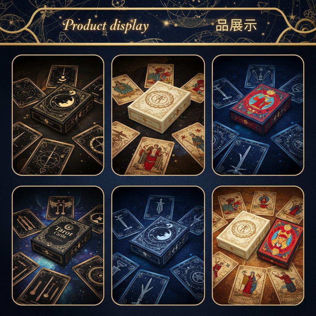
The tarot deck example is a good one because it combines two printing challenges at once: the cards themselves and the box or deck packaging. In the product set shown, you can see compact decks with full-color artwork, ornate borders, and metallic-looking accents that suggest premium presentation. That is typical of giftable spiritual products, collector items, and retail decks sold through ecommerce or specialty shops. When the finish is right, the packaging does half the selling before anyone opens the box.
Why print quality matters more than most buyers expect
With business card printing, people often focus on first impressions. With custom card printing, the pressure is higher because the product is handled repeatedly. Cards are shuffled, fanned, stacked, and displayed. That means poor ink coverage, weak coatings, or flimsy stock show up fast. A glossy brochure can hide a lot; a deck cannot.
That is why professional card printing usually depends on a few fundamentals: clean color reproduction, consistent trim, durable surface finishing, and artwork that still reads when scaled down to a small format. If the design uses fine linework or dark backgrounds, the margin for error shrinks. A small shift in registration can make borders look uneven or type feel off-center. Buyers should insist on reviewing print samples, not just digital files, whenever possible.
What the tarot deck format tells you about production choices
Tarot and oracle decks are often positioned as premium consumer goods rather than plain stationery. That changes the printing brief. In the deck set shown, the artwork carries the product identity. Boxes use strong color contrast—black and gold, cream, blue, pink—while the cards themselves appear to follow the same visual language. This kind of coordinated design is common when the packaging has to communicate theme, mood, and gift value at a glance.
Common elements buyers should ask about
For high quality card printing, buyers typically need clarity on card stock, coating or varnish, box structure, and any special decoration such as foil-like detail or embossing. The image suggests specialty finishing, but it is safer to treat that as a visual cue rather than a confirmed process. If you need premium shelf appeal, ask the supplier exactly how the metallic effect is produced and whether it is real foil stamping or simply printed artwork.
Packaging is not an afterthought
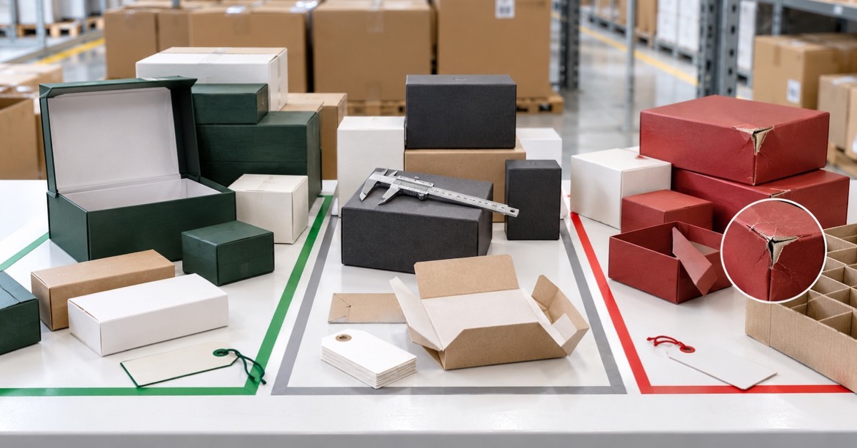
Many card projects fail at the box stage. A deck can be printed well and still feel underwhelming if the packaging bends easily, opens too loosely, or looks generic beside the artwork. Tarot buyers tend to care about presentation because the box becomes part of the ritual, the gift, and the collection value. For ecommerce, it also matters in the product photo.
Rigid card boxes, folding cartons, and tuck boxes each serve different budgets and brands. A rigid setup may support a premium position, while a lighter carton can work for lower-cost retail. The right choice depends on how the deck will be sold, shipped, and stored. If the product is meant for gift shops or spiritual retailers, the outside of the box often carries as much emotional weight as the cards inside.
How to compare printing options without getting lost in jargon
If you are comparing suppliers for card printing, keep the discussion anchored to use case. A promotional deck for a trade show does not need the same finish as a collector tarot set. A sample pack for distributors may only need decent print and reliable assembly. A premium retail deck needs more discipline across every detail.
Useful comparison points include image sharpness, color consistency across a run, corner finish, deck sizing, box durability, and whether the printer can manage both the cards and the packaging as one coordinated job. That last point is worth emphasizing. Splitting the work between vendors can save money on paper, but it often creates color drift and timeline headaches.
Practical mistakes that cost time and margin
The most common mistake is designing too close to the edge without accounting for trim and fold tolerances. Another is using artwork that depends on subtle gradients or tiny type, then expecting perfect reproduction on coated paper or textured stock. Buyers also sometimes approve a beautiful mockup and forget to ask how the finished deck will be packed for shipment. If the product arrives scuffed, all the print quality in the world will not save the launch.
There is also a branding trap. Some teams overdesign the deck and box at the same time, which can make the product feel busy. The best card printing projects usually have one visual priority: either the imagery leads, or the typography does. Trying to force both to dominate often weakens the result.
What a sensible buyer should ask for next
Before placing an order, ask for physical samples, confirmation of materials, and a clear explanation of the printing and finishing steps. If the deck is intended for retail, ask how the packaging will protect the cards during transit and whether the final presentation matches the target price point. For business card printing and larger commercial jobs, the same discipline applies: sample first, scale later.
If you are planning a tarot deck, game deck, or branded collectible, start with the product’s final use. Then work backward through artwork, material, box style, and finishing. That is the quickest way to get custom card printing that looks premium on the shelf and still performs once customers start handling it.
FAQ
What makes tarot card printing different from standard card printing?
Tarot decks usually demand more attention to artwork, box presentation, and perceived value. They are often sold as gifts or collectibles, so finish and packaging matter more.
Is foil always necessary for a premium look?
No. Foil can elevate a deck, but strong composition, color control, and good box design can do a lot on their own. Use specialty finishing where it supports the brand, not just because it looks luxurious in a sample image.
Should I print cards and boxes with the same supplier?
Often, yes. One supplier can better coordinate color, timing, and assembly. That is not always mandatory, but it usually reduces risk.
If you are evaluating a new deck project, the next step is simple: request a sample specification and compare a plain prototype against your premium version before you commit to a full run.