

Card printing for tarot decks, game boxes, and retail presentation
Card printing is not just about putting ink on paper. In packaging and tabletop products, it is the difference between something that looks collectible and something that looks generic on a shelf. That matters when you are launching tarot decks, small-batch game components, or a branded product line that depends on visual appeal at first glance. In this category, the print quality carries the sale before anyone touches the cards.
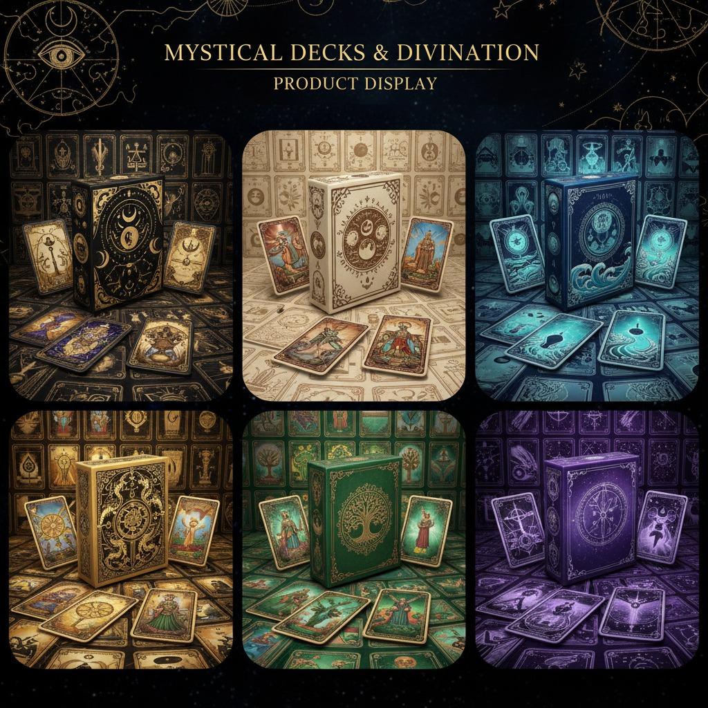
The product examples here point to a familiar reality in consumer packaging: deck boxes and display sets have to do several jobs at once. They protect the contents, communicate the theme, and make the item feel worth keeping. For tarot, that often means ornate artwork, symbolic iconography, and a box structure that feels sturdy enough for gifting or repeat use. For buyers, the decision is rarely “Can it be printed?” The real question is “How well does the printing support the brand, the shelf, and the unboxing experience?”
What good card printing needs to accomplish
A well-executed printed box or card set should do three things clearly. First, it should reproduce the artwork with enough contrast and color control that the design still reads under store lighting and in online photos. Second, it should match the physical format of the deck or insert without looking oversized, flimsy, or awkward. Third, it should survive handling, shipping, and retail display without scuffing immediately.
That sounds simple, but the details matter. A matte surface can make tarot imagery feel more premium and less flashy. A semi-gloss finish can add depth to saturated colors. Metallic effects may be used to suggest foil, though in some cases they are achieved through printed inks rather than true stamping. If you are buying custom card printing for a launch, it is worth asking exactly how the effect is produced, because visual impact and production cost are not the same thing.
Packaging styles that show up most often
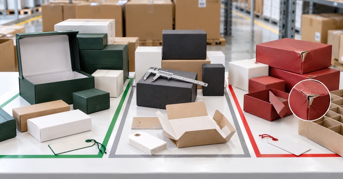
The imagery here suggests rigid rectangular paperboard boxes and display-ready deck packaging. That is a common route for tarot cards and playing-card-style products because the format is familiar to consumers and efficient to stack, ship, and merchandise.
Rigid or semi-rigid deck boxes
These are often chosen when the buyer wants a giftable feel. They can carry rich artwork on every visible panel and give the product more presence than a simple folding carton. For premium launches, this is usually the safer choice.
Tuck-top style cartons
Tuck-top cartons are more economical and can still look polished if the print work is strong. They are often used when the budget leans toward artwork and print finish rather than heavy board construction.
Display-oriented sets
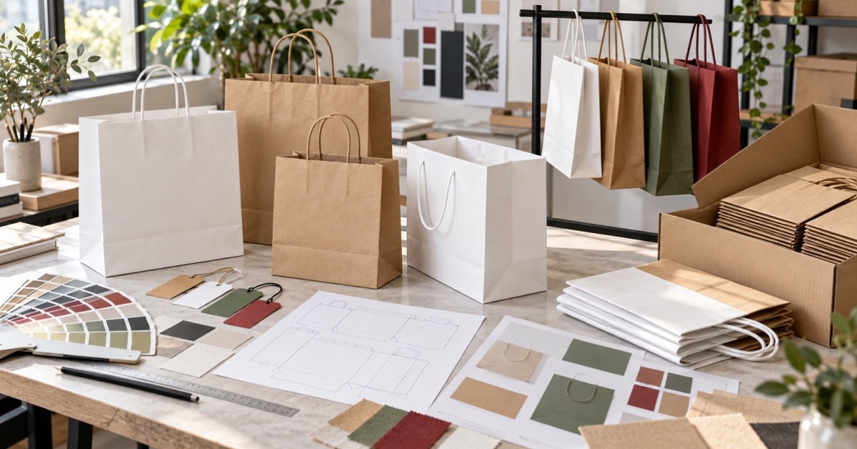
When the packaging needs to sell in multiples or photograph well for e-commerce, the layout becomes part of the product story. Multiple colorways, matching card backs, and front-cover artwork all help the deck line feel cohesive.
Choosing between business card printing, professional card printing, and product packaging
The terminology can blur, but the use case should drive the spec. Business card printing is usually about compact identity pieces and quick recognition. Professional card printing in a retail context often means better color control, cleaner finishing, and a more durable feel. Custom card printing for tarot or game packaging is broader still: it includes the box, the card stock, the surface finish, and sometimes the insert or display arrangement.
A buyer should think in this order: what the customer sees first, what gets handled most, and what must stay visually consistent across the full run. If the deck art is dense or symbolic, registration and color fidelity deserve close attention. If the brand depends on luxury cues, surface treatment may matter as much as the artwork itself.
Common mistakes buyers make
One frequent mistake is approving art on a screen and assuming the print will look identical in hand. It won’t. Dark backgrounds, gold tones, and fine linework can shift noticeably depending on paperboard, coating, and print method.
Another is overlooking retail photography. A box that looks acceptable in person may flatten badly under online lighting if the contrast is weak or the finish reflects too much glare. For collectible decks, that can hurt conversion more than most teams expect.
There is also the practical issue of structure. Decorative art is important, but a weak box that opens too easily or scuffs in transit will create more complaints than a slightly simpler design ever would.
What to ask before approving a print run
If you are evaluating high quality card printing for a deck launch or branded box set, ask for samples that show the actual surface, not just artwork proofs. Ask how metallic effects are achieved. Confirm whether the box is intended for retail presentation, mail shipping, or both. And if the product needs to support multiple designs, make sure the colorways are consistent enough to look intentional when displayed together.
That last point is easy to underestimate. A coordinated set can look premium. A near-match with inconsistent blacks or uneven tone can look like leftovers.
Buyer takeaway
For tarot, collectible decks, and related packaging, card printing is really a branding decision disguised as a production choice. The right spec protects the product, supports the price point, and makes the artwork do its job. The wrong one can make even strong designs feel disposable.
If you are planning a new deck, launch set, or retail display package, start with the end use: shelf, gift box, or e-commerce image. Then align the print method, paperboard, and finish to that use before you lock the artwork. That order saves rework, and usually saves budget too.
FAQ
Is card printing only for cards?
No. In practice, it often includes boxes, inserts, sleeves, and display packaging around the cards.
What gives tarot packaging a premium feel?
Strong artwork, a solid box structure, controlled color, and a finish that matches the brand. Matte and semi-gloss treatments are common starting points.
Should I prioritize print effects or structure?
Structure first if the product will be handled or shipped often. Print effects matter, but a fragile box undermines the whole package.
What is the safest next step?
Request a sample or mockup of the exact format you plan to sell, then compare it against your retail and shipping requirements before committing to volume.