

Why card printing choices matter for tarot and collectible decks
Card printing is not just about putting artwork on paper. For tarot decks, collectible game sets, and other themed card products, the printing and packaging have to do several jobs at once: protect the deck, support the brand, and create a first impression that feels worth keeping. That is especially true for tarot packaging, where the box often carries as much visual weight as the cards themselves.
Buyers looking at business card printing or broader custom card printing services often focus on image quality first. That matters, but for deck packaging there is another layer: the box must open cleanly, hold shape on a shelf, and present the artwork without looking flimsy. A box that scuffs too easily or loses its structure can make a premium deck feel ordinary fast.
What the tarot box display suggests about modern packaging demand
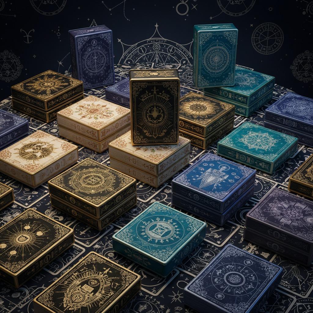
The product described here shows multiple rigid or tuck-style deck boxes in different colorways, with ornate borders, circular emblems, and tarot-themed titles such as “Tarot Cards” and “The Fool.” That mix points to a packaging market that values variation. One design may use a dark, mystical palette; another may lean toward cream, pink, gold, or blue. For brands, the takeaway is simple: the packaging itself can signal edition, theme, or collector value before a customer ever opens it.
That is where professional card printing becomes more than a production step. It becomes part of the merchandising strategy. A visually coherent box series helps a supplier, publisher, or private label brand create a stronger catalog presence, and it gives retail buyers a clearer sense of range.
Common card printing approaches for deck packaging
Offset and digital printing
For printed paperboard packaging, offset printing is often chosen when color consistency and volume are important. Digital printing is useful when runs are shorter, artwork changes frequently, or a buyer needs flexibility across multiple designs. The image suggests a product line that could work well in either format, depending on order size and finish requirements.
Paperboard, folding, and rigid structures
Most deck boxes rely on paperboard or cardstock-based construction, then move through die-cutting, folding, and gluing. Some versions may use a tuck-box format; others may be two-piece or sleeve-style presentation boxes. The structure matters because a tarot deck box is expected to survive handling, shipping, and repeated opening. A good-looking box that collapses under pressure is a poor bargain, even if the print quality is excellent.
Surface finishes that change the buyer’s perception
Some of the visible designs appear glossy or metallic, and a few seem to suggest foil-like decoration, though the exact process cannot be confirmed from the image alone. Still, the market lesson is clear: finish selection changes perceived value. Matte can feel restrained and premium; gloss can sharpen color and contrast; metallic accents can push the piece toward giftable or collectible territory. For spiritual or occult-themed products, that visual tone is often part of the appeal.
How to evaluate professional card printing vendors
When sourcing high quality card printing for packaging, buyers should look beyond the sample image and ask a few grounded questions. Does the supplier show consistent color across multiple variants? Can they reproduce fine linework and ornamental borders without muddy edges? Is the box style suitable for the deck weight and the expected retail environment? These questions sound basic, but they save a lot of trouble later.
It also helps to request clarification on items that are easy to assume and expensive to discover too late: paper thickness, coating choice, closure style, insert options, and whether the packaging is intended as a finished retail box or a display sample. If a supplier is vague on structure, treat that as a warning sign.
Practical mistakes buyers make with custom card printing
One common mistake is designing for the artwork only and forgetting the physical experience. A deck box with stunning graphics can still disappoint if the opening flap weakens, the surface marks easily, or the scale feels awkward in hand. Another mistake is overloading the design with effects just because the product is meant to look premium. Too much shine, too much contrast, or too many visual layers can make the box feel busy instead of memorable.
There is also a budget trap. Buyers sometimes compare custom card printing quotes as if all finishes and board grades were interchangeable. They are not. A lower quoted price may reflect simpler construction, thinner stock, or fewer finishing steps. That may be acceptable for some lines, but not for collector-oriented packaging.
What this means for brands and sourcing teams
If you are developing tarot packaging, the best decision is rarely the flashiest one. It is the one that matches the product’s market position. A mass-market deck needs durable, economical packaging with clean branding. A gift or collector deck may justify richer finishes and more elaborate presentation. In both cases, the print work must support the deck rather than compete with it.
For sourcing managers, the smart move is to compare samples on structure, print clarity, and finish stability, not just on artwork. For product teams, the question is whether the box helps the deck sell itself on a shelf, in an online thumbnail, and in a customer’s hand. That is the real job of card printing in this category.
Next step for buyers
If you are planning a new deck release or refreshing an existing line, start with a packaging sample that matches your target audience and retail channel. Then test the structure, the color, and the unboxing feel before locking the artwork. A good tarot box should do more than hold cards; it should help the product earn its place in a crowded market.